Redesigning a Telco App Experience for 200,000 Users.
When every telco offers the same plan, the only way to win is to let users build their own.
Introduction
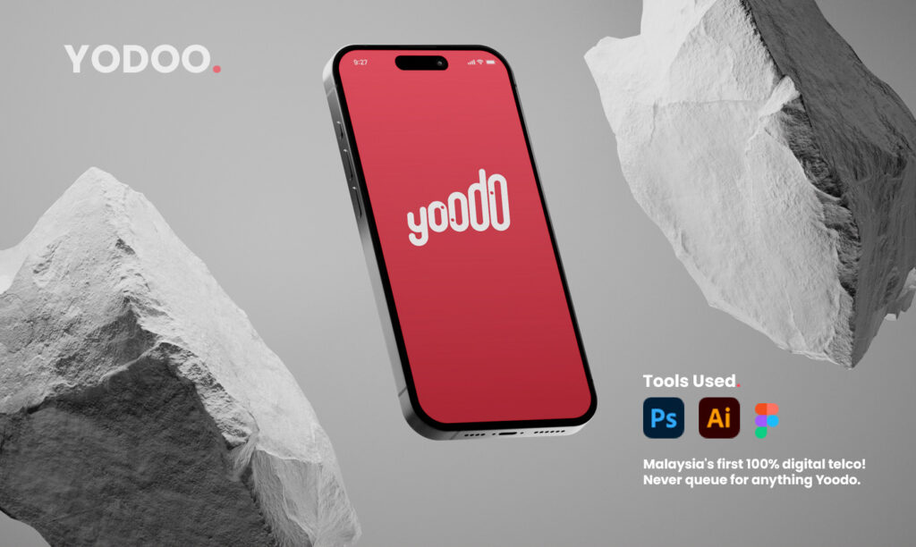
Yoodo was Malaysia’s first fully digital and customisable mobile service, created to give users greater control over their mobile plans. Unlike traditional telco providers that offered fixed packages, Yoodo allowed customers to customise their data, calls, and SMS according to their individual needs through a single mobile application.
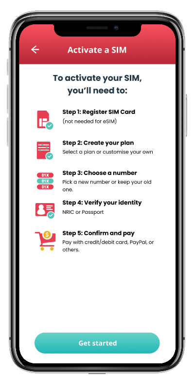
Built around a digital-first approach, the app enabled users to manage every aspect of their mobile experience – from purchasing and activating SIM cards to modifying plans, making payments, and accessing customer support. By eliminating the complexity often associated with telecommunications services, Yoodo delivered a more flexible, transparent, and user-centred experience.
This case study explores how thoughtful UX design can simplify mobile plan management, empower users with greater personalisation, and create a seamless self-service experience within the telecommunications industry.
Client
Yoodo
My role
Senior UI/UX Designer
Team
Senior Product Manager, Director of Content,
VP of Marketing
Services
Product Design
Design System
Industry
B2C
Platform
Mobile App
Website
Problem
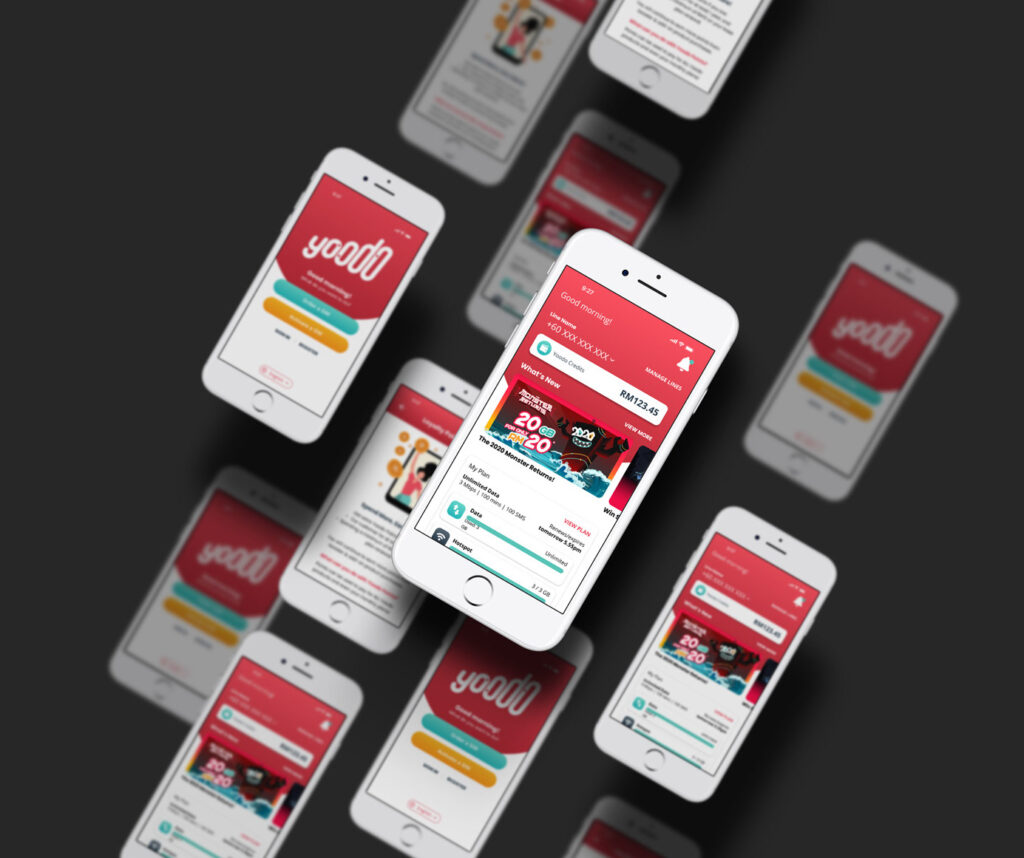
Malaysia’s telco market is dominated by legacy giants such as Maxis, Celcom, Digi – each pushing rigid, one-size-fits-all plans. Yoodo’s edge was flexibility, but the app wasn’t reflecting that promise. I was tasked with refreshing the user interface and designing new features to keep the product competitive, performant, and visually coherent – ensuring users could experience that flexibility effortlessly, end to end.
Defining the Problem
How do you make a fully digital telco app feel indispensable when users have dozens of alternatives a download away?
Goals
BUSINESS GOALS
Modernise the Yoodo app interface to reflect the brand’s core promise — radical customisation — while raising the bar on usability, visual consistency, and performance perception. Every screen needed to feel like it belonged to a product that takes the user seriously.
User Goals
- Own their plan — configure data, voice, and SMS exactly the way they want, without friction
- Trust the app — find what they need quickly, with a UI that feels stable and familiar
- Feel the difference — experience Yoodo as distinctly more personal than any competitor plan
Impact
The project was delivered through a phased rollout strategy, allowing the team to validate improvements and minimize disruption to existing users. While measurable outcomes were achieved, detailed metrics have been excluded due to confidentiality constraints.
Reduction in drop-off during plan customisation flow.
Improvement in task completion rate for first-time users.
Increase in session duration or return visits post-redesign
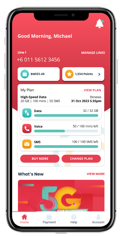
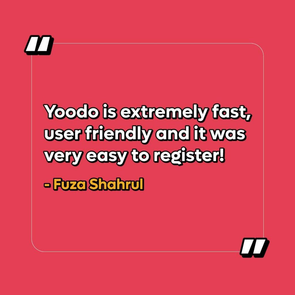
Users responded positively to the redesign, citing a noticeably friendlier interface and faster app experience
Our users
Yoodo’s users were digitally native, value-conscious Malaysians who refused to overpay for minutes they’d never use. They compared plans, read reviews, and expected an app experience on par with fintech and e-commerce standards — not the clunky portals of traditional telcos. Understanding that expectation gap was central to every design decision made in this project.

The Modern Saver
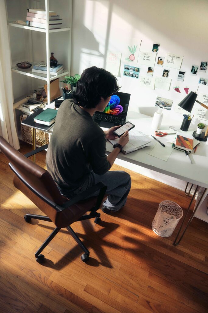
Digitally savvy, value-conscious Malaysians who compare plans before they commit. They know exactly how much data they use, resent paying for minutes they’ll never call, and expect an app experience that matches the standards set by fintech and e-commerce — not the clunky portals of traditional telcos.
The Always-On Hustler
Freelancers, side-giggers, and small business owners who live on their phones. Data is a utility, not a luxury — they need it fast, reliable, and scalable on demand without being locked into a plan that doesn’t move with them.

The Digital Native
Young Malaysians, students and early-career professionals, who grew up streaming, scrolling, and switching. They’re the first to try a new app and the first to leave if it feels outdated. Brand loyalty means nothing — experience means everything.
Process
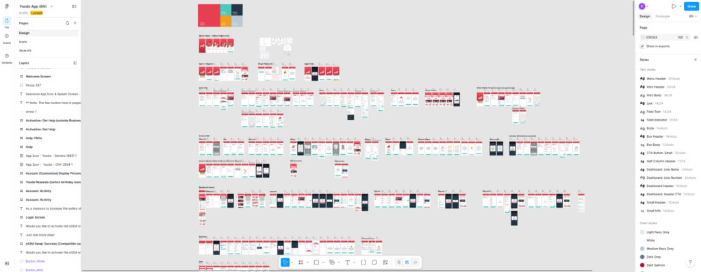
The redesign began with a thorough audit of the existing app — mapping user flows, identifying friction points, and benchmarking against leading regional telco and fintech apps. From there, I worked closely with the Senior Product Manager, Director of Content, and VP of Marketing to align on priorities before moving into wireframes and high-fidelity design. Iterations were validated against user feedback and refined until every core flow felt seamless. A consolidated design system was established to ensure consistency across all existing and future screens.
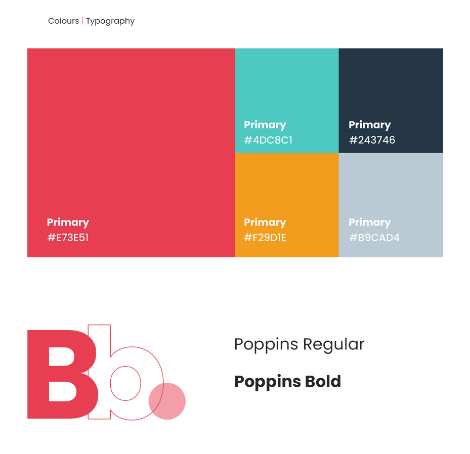
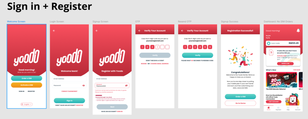
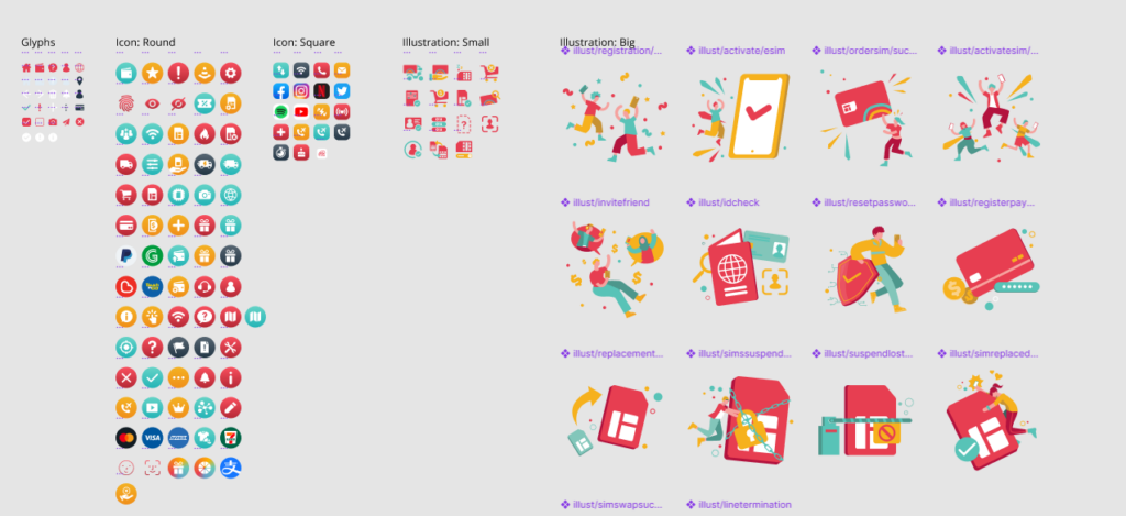
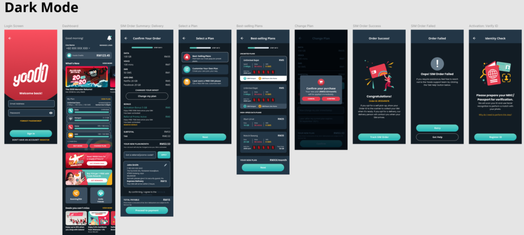
Final Designs
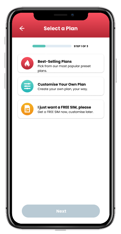
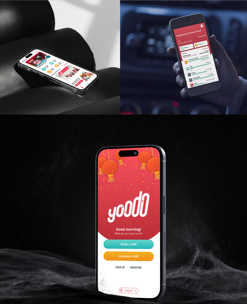
A walkthrough of the redesigned screens from the plan customisation flow to the dashboard, account management, and onboarding reflecting a cleaner visual language, improved hierarchy, and a UI system built to scale.
Beyond the App — Owning the Full Digital Experience
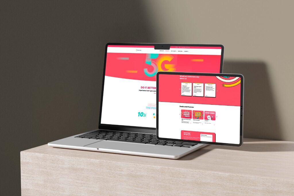
The redesign didn’t stop at mobile. I extended my role to Yoodo’s marketing website — handling end-to-end UI updates in WordPress using WPBakery, writing custom HTML and CSS for bespoke components, and translating campaign materials into polished, on-brand web experiences. Every update was executed with production-level care, balancing design fidelity with the speed a live marketing site demands.
What I Learned
Working in a competitive, fast-moving telco environment taught me how to balance brand ambition with real user constraints. Designing for customisation sounds freeing — but it demands rigorous structure underneath. I also learned how to navigate cross-functional stakeholder input (Product, Marketing, content) without losing design integrity and how to build a design system that gives a growing team confidence rather than confusion.